I finally overcame my reservations about making video content, and started on a series of case studies. Turns out, I am quite terrible at editing. So now we’re blogging it. Welcome!
My old friend asked me if I would take on a branding project for his mother’s new juice business. I said sure, but advised him to focus on locking down a supply of quality bottles – I’d let him know when my schedule freed up. That didn’t happen for a month or so…
So when I did find the time, I tried to pick up the conversation with some vim, delivering the concept he had casually mentioned for her sobolo drink.
It worked. Only one brother bucked the chorus of enthusiastic admiration, by observing that the red text would be hard to read on a bottle full of crimson Bissap. I was embarrassed to have overlooked this, but I welcomed the constructive feedback.
Unfortunately, we didn’t move straight on to press. They suspected that their mother might want something more conventional. Thankfully, I also do conventional. I have been a fan of conventional since I saw this xkcd poster.
I suggested, quite seriously, that we should double down on conventional, and call the drink ‘Bissap’. The branding committee came back with a casual yes, which I was happy to play along with. And then their mother, bless her heart, stepped in to change it. What to? Sobolo.
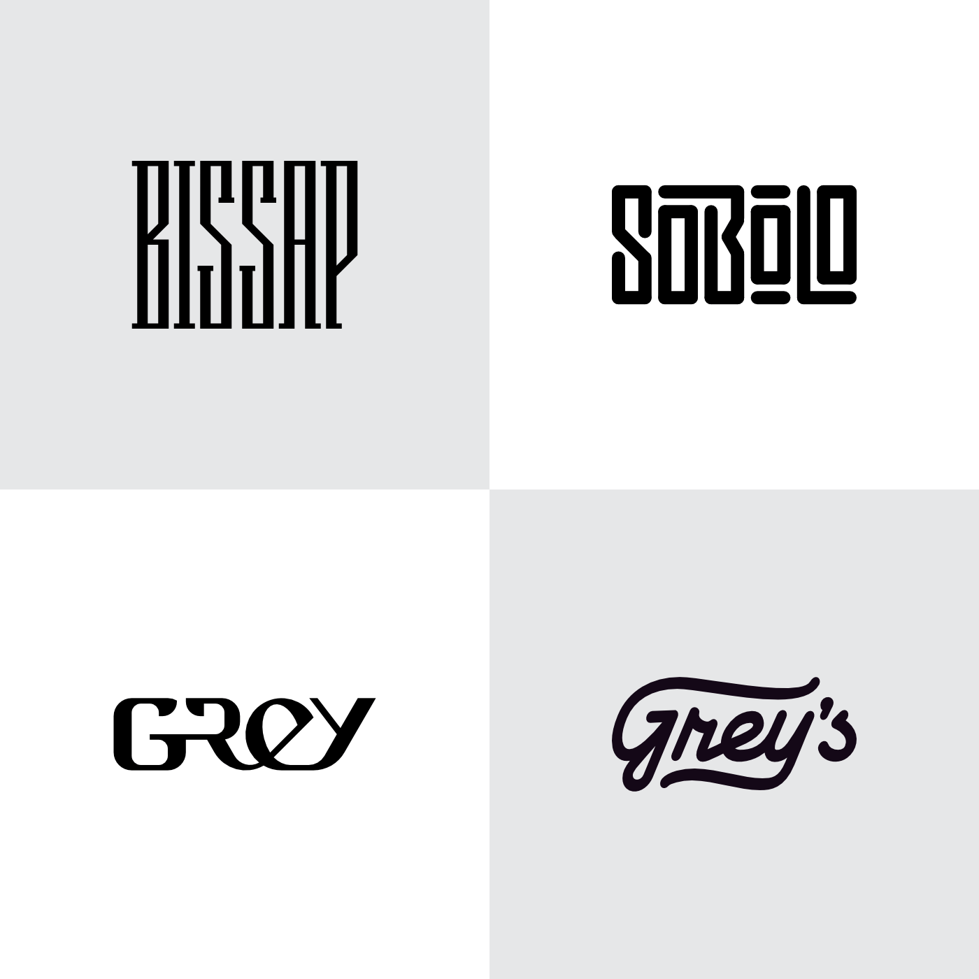
Unfortunately, she also asked us to put everything under the umbrella brand of ‘Grey’. ‘Grey Juices’; ‘Grey Sobolo’. My friend failed to dissuade her, because he was the one who had started shortening the family surname that way… I proposed that we could make sure that the ‘Grey’ didn’t read as an adjective for the drinks, by dialing down the legibility.
My friend loved the first concept, almost luxury in its tone. We had actually printed a first batch when his mother humbly asked for something a bit more approachable. A bit more readable.
This reinforces the classic moral: do not deal with multiple levels of decision-makers.
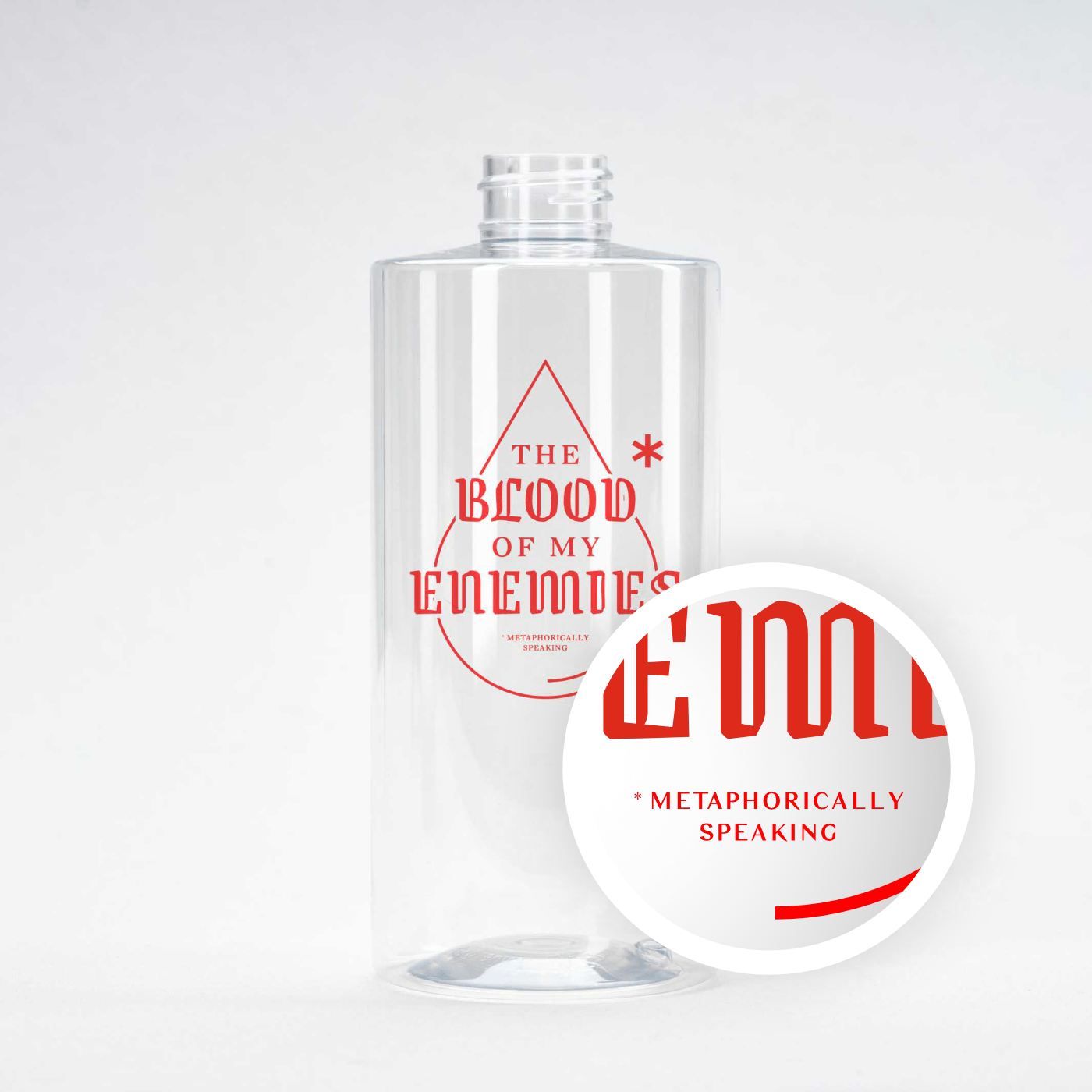
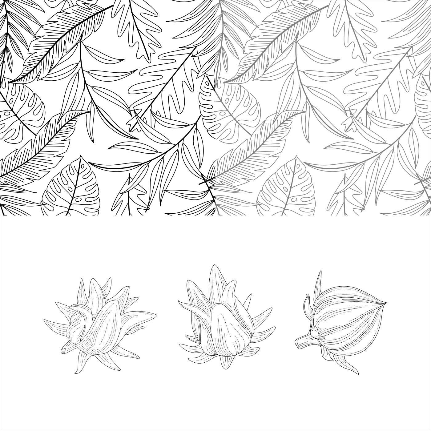
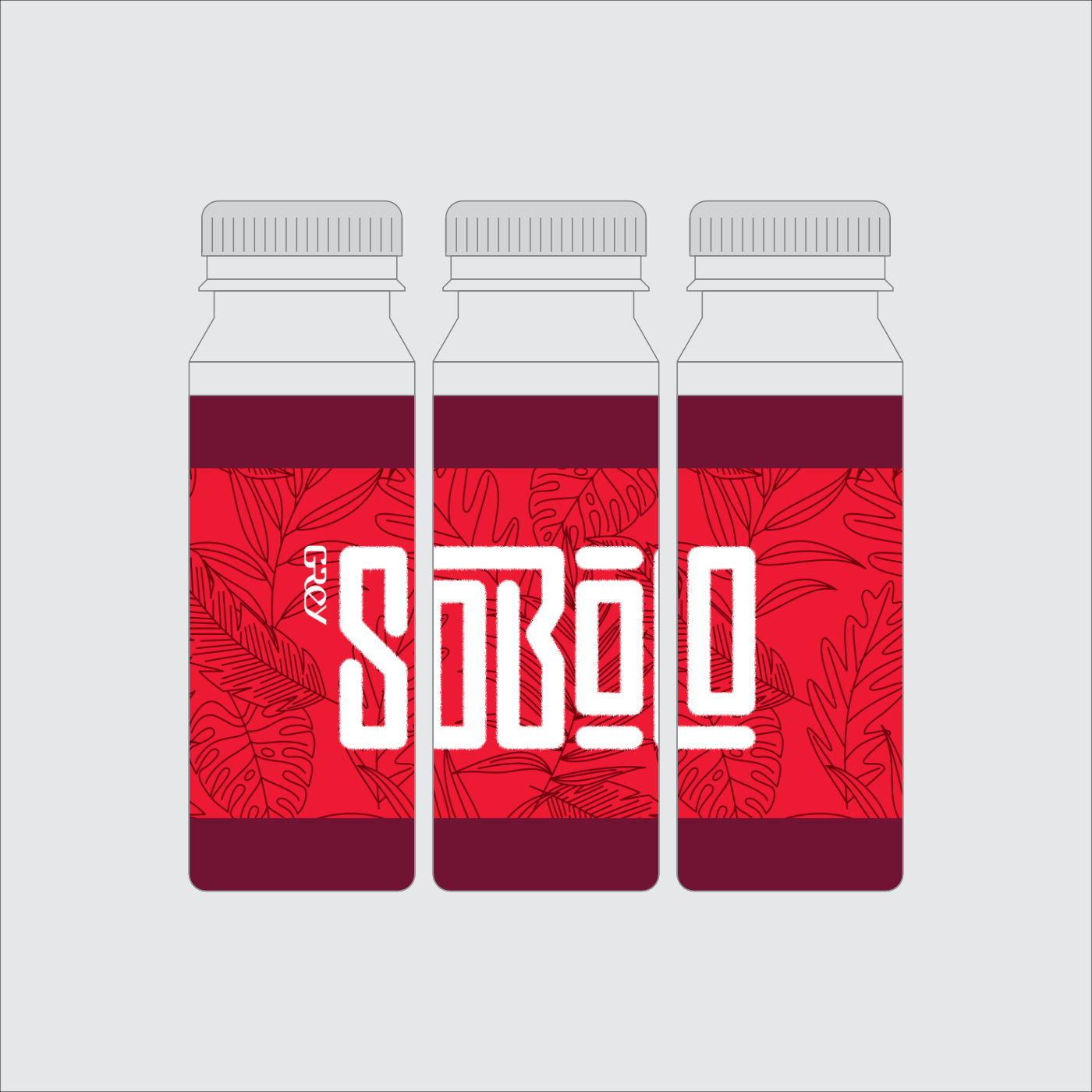
I had approved the lockup for ‘Sobolo’, and advised that we should emphasize the intent behind the name with jumbo text. So for the rest of the label design, I focused on exploring ways to support the text with line art, both in the foreground and background. (I started with the etching style I am comfortable with, before realizing that a tropical line pattern would be much better. The ‘etched’ hibiscus roselles went unused, because somebody thought they looked like marijuana…)
The jumbo text was supposed to wrap all around the bottle, for which I recommended a square form factor. This would make it easier to arrange the bottles on a shelf in a striking way. In the business of store environmental graphics, this is a tactic to improve a product’s footprint.
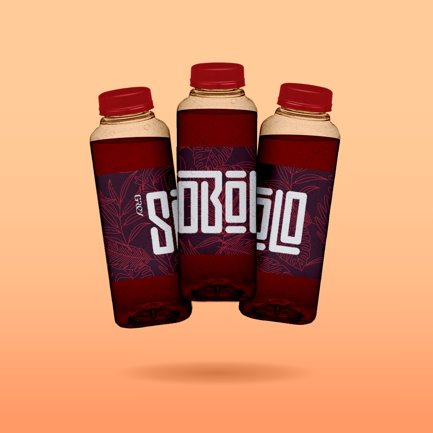
I faked a trendy 3D mockup of the first approved version for a possible brand reveal. We revised the colour hierarchy after the constructive-feedback brother mused, “Why does this look like it contains alcohol somehow?” Not sure why, but I could see what he meant. So we went with a more cheerful version.
We did a set of print samples, and the concept proved effective! Sobolo product done.
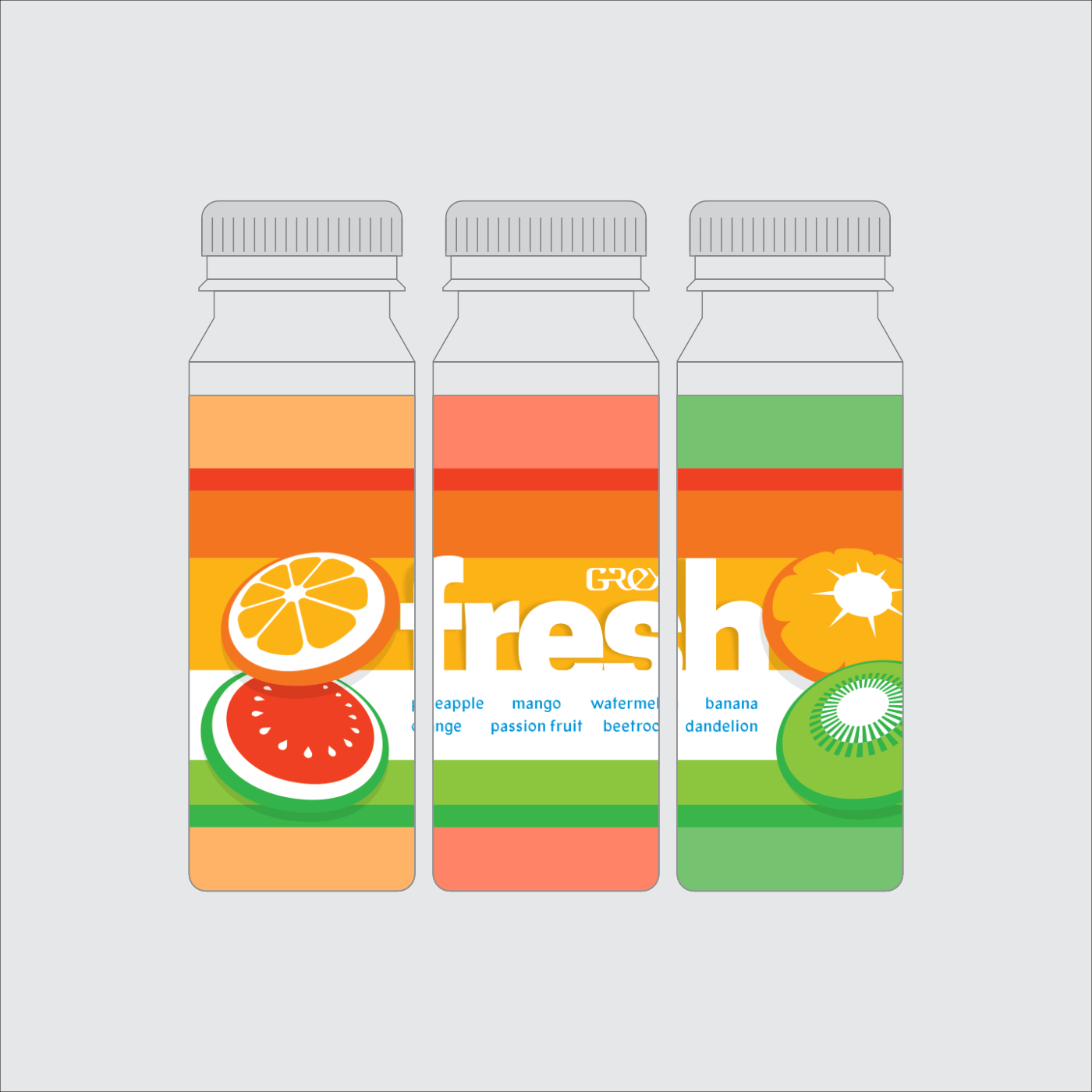
Next, I had to find a way to reduce the printing overhead for all the fruit juices, by putting all the variants on one label. Without it feeling cheap, of course.
This request totally fell off the table later, when the client decided to go all in on smoothie blends, where each blend would have all the ingredients on display. I like this approach of one-label-fits-all though, saves a lot of trouble for a small producer.
My solution was to make the list a feature of the label, not an afterthought. Of course, we wanted to keep the jumbo text so that the juices wouldn’t look weak next to the Sobolo. The client didn’t think little tick boxes would be enough to tell different variants apart, so the background needed to be white. I decided to make that another feature.
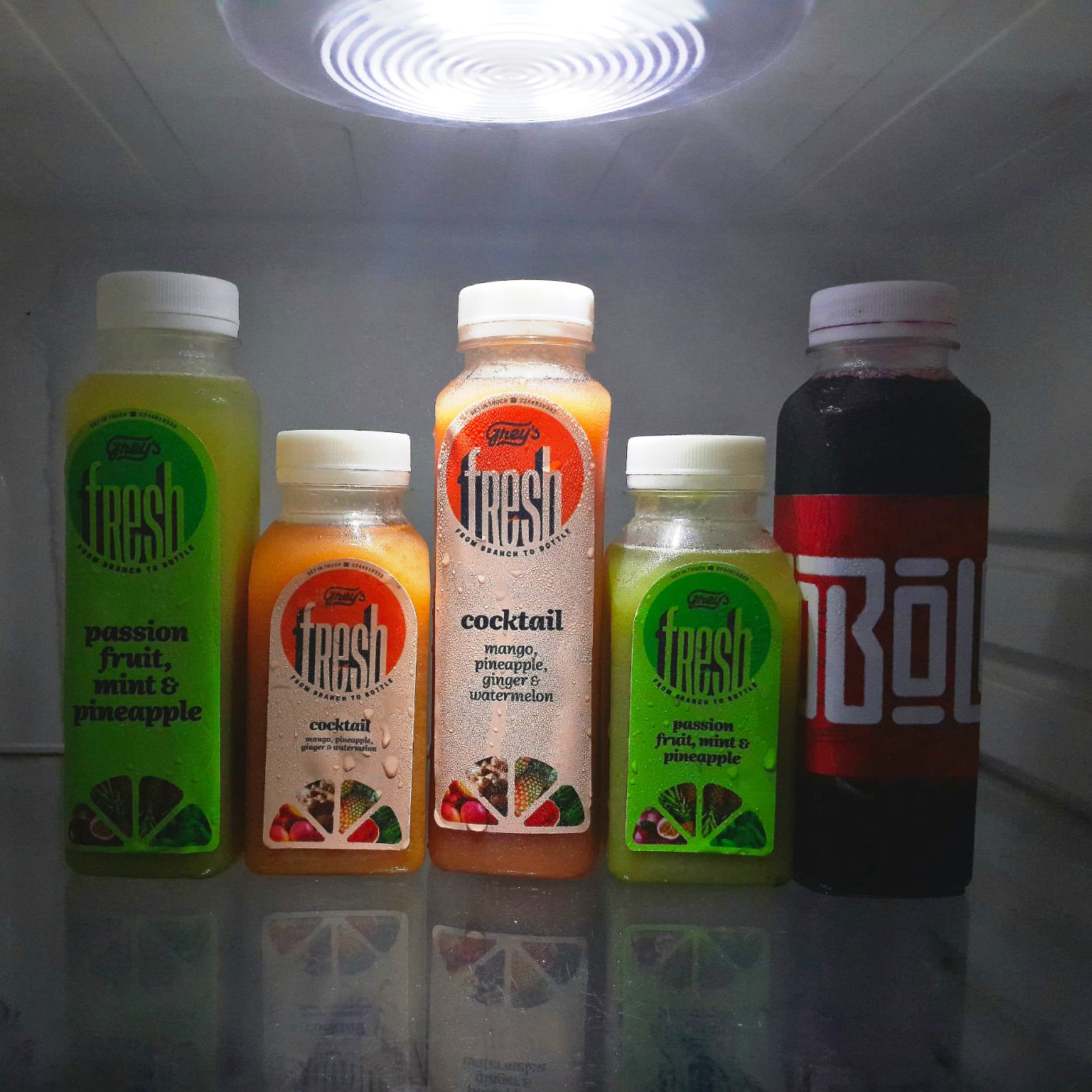
Was there a name for all the juices? The client said ‘Grey Juices, of course.’ I conspired with my friend, and went big on another simple word: ‘Fresh’. We would emphasize this message with slices of fruit essentially floating in the middle of the bottle.
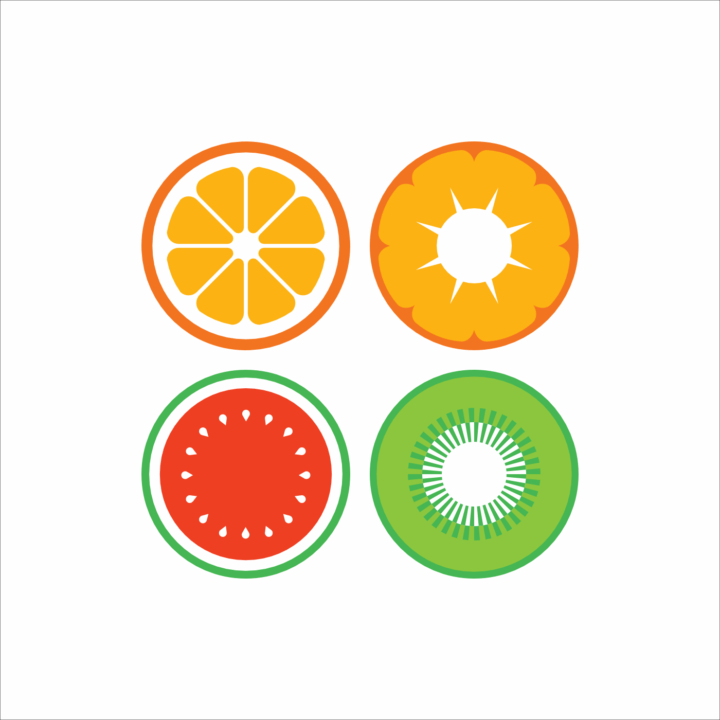
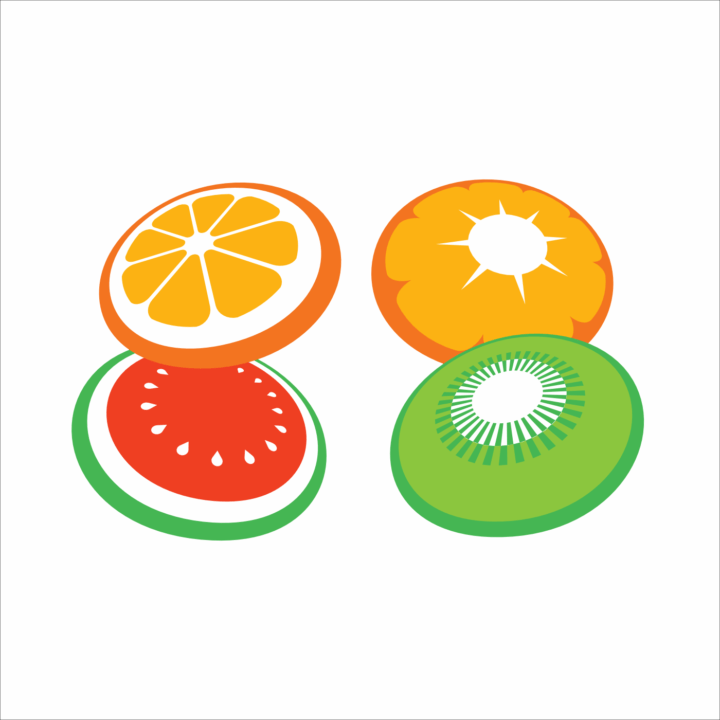
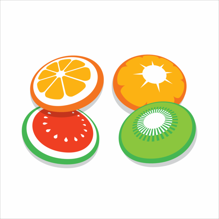
I have experimented a lot with printing textures and dimensionality, so I know how easy it is to mix your visual metaphors. I restricted myself to flat colour, only using shadows where it made sense and offered real interest. The palette was chosen to suggest as many fruit blends as possible.
Another label completed! My friend was happy, the client was sure we knew best; I made another mockup to celebrate.
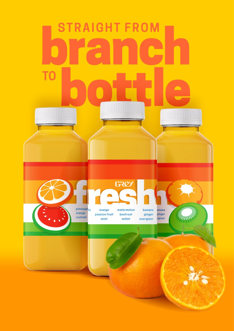
And then the print samples came through. The client had not noticed the labels were wrapping around the bottle. She confessed she was dreading the work of aligning the stickers correctly each time… Again, I blamed her son to hide my shame at skipping the consultation stage.
She thought it might help to send me some Pinterest examples of others doing vertical label designs, which are trendy enough that I had fought the urge to recommend them. (Now I realize how they simplify the work for the client, I salute whoever tried it first.)
I aimed to dissect the form of the label, with one cutout illusion for the brand name, and another for the main ingredients. (Poor label design in Ghana tends to crowd all the ingredients together; we stuck to a maximum of four, neatly separated in fruity wedges.)
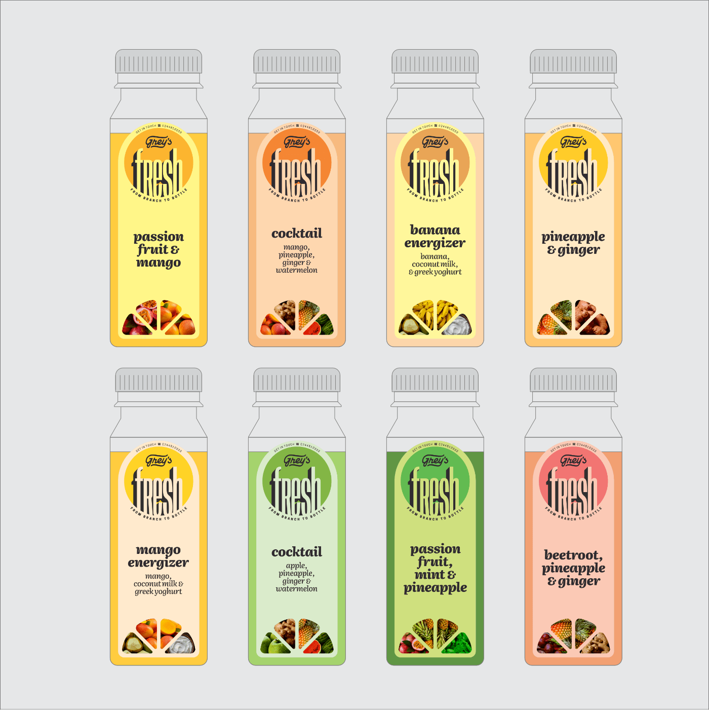
Interestingly, I used Literata, the font on this site. The upright italics are just so interesting to work with! The overall effect seesaws between vintage grocery branding, and the design language of modern wellness.
No mockups this time – I was juggling deadlines on two other projects, one of which I may discuss next… I was very grateful to hand things over to another good friend of ours, who has an excellent digital printing service. A few weeks later, I had this pleasant surprise at a church gathering.
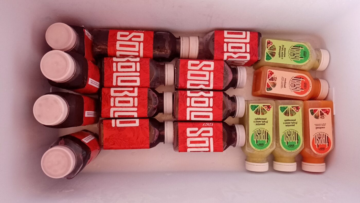
I got a set to take home as well, thanks to a very pleased client. I should have taken some photos as soon I got them in… When I checked the fridge the next day, the bottles had mysteriously reduced in number.
It’s embarrassing to think how few photos I have of my work in real life; that is one thing I hope to work on this year. I hope they all turn out this nicely.
It’s interesting how the crazy projects always hold the most interesting lessons, and it is always nice to be working with friends. As long as the work stays professional, the randomness almost feels like a plus. I definitely enjoyed myself, and did not miss long email chains, pitch decks, and corporate politics. Unless me blaming my friend counts as politics…
They tell designers to only show their best, most professional work. This hardly qualifies: I skipped project discovery, took some unilateral decisions, and generally treated it like a hobby project. Hopefully nobody thinks this is how I work with clients who aren’t a set of four crazy brothers that I have known for two decades… But if you do, and the craziness actually appeals to you, then we should definitely talk right away.
Leave a Reply