Every year, around the middle of February, I think to myself: “Hm. 6th March coming up, should do something.” This year was no different; was fairly confident I would, right up to Monday the 4th, when I got a call scheduling an important project meeting for Tuesday.
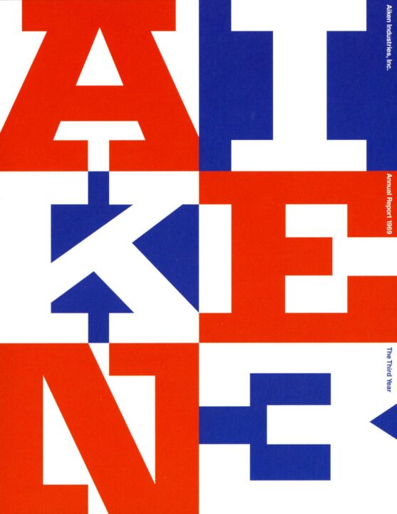
Anyway. I almost have too many Ghana-related tee designs already, so I had a vague intention to aim for a poster this time. This crystallized when I saw this very cool cover from Chermayeff, Geismar and Geissbuhler.
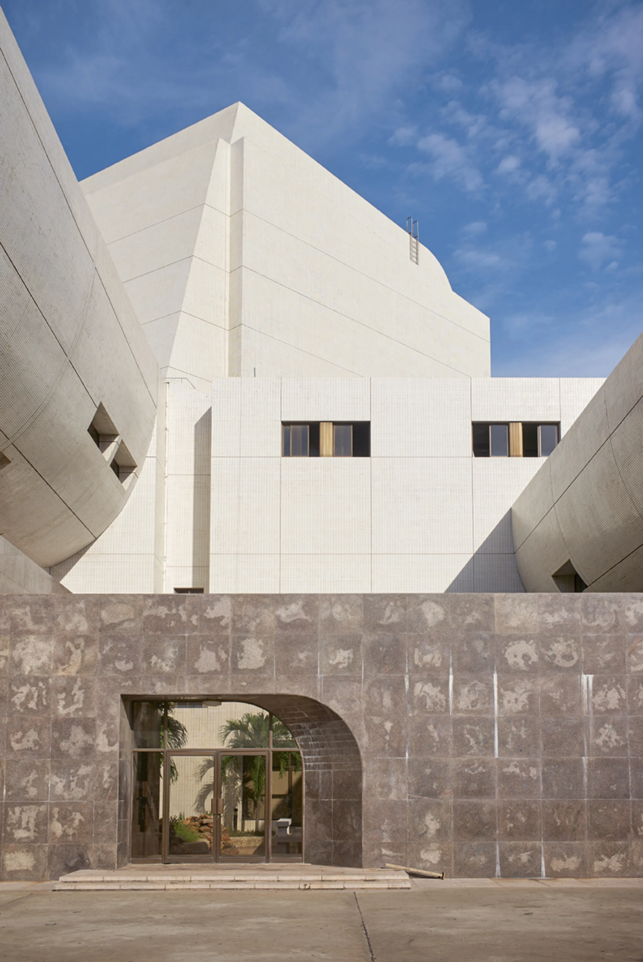
Last year, I got to visit Barbara Incoom at Delta Paper for a mentorship program, and had a nice long session with the in-house designer, Iddrisu Sulemana. His exploration of the rich textures of the façade of the Kwame Nkrumah Mausoleum stuck in my mind, and showed up halfway through the design. (Three “of the’s” in that sentence.) I actually misremembered the building as the National Theatre in Accra, which has similar marbling on its façade – so I spent half an hour learning about that.
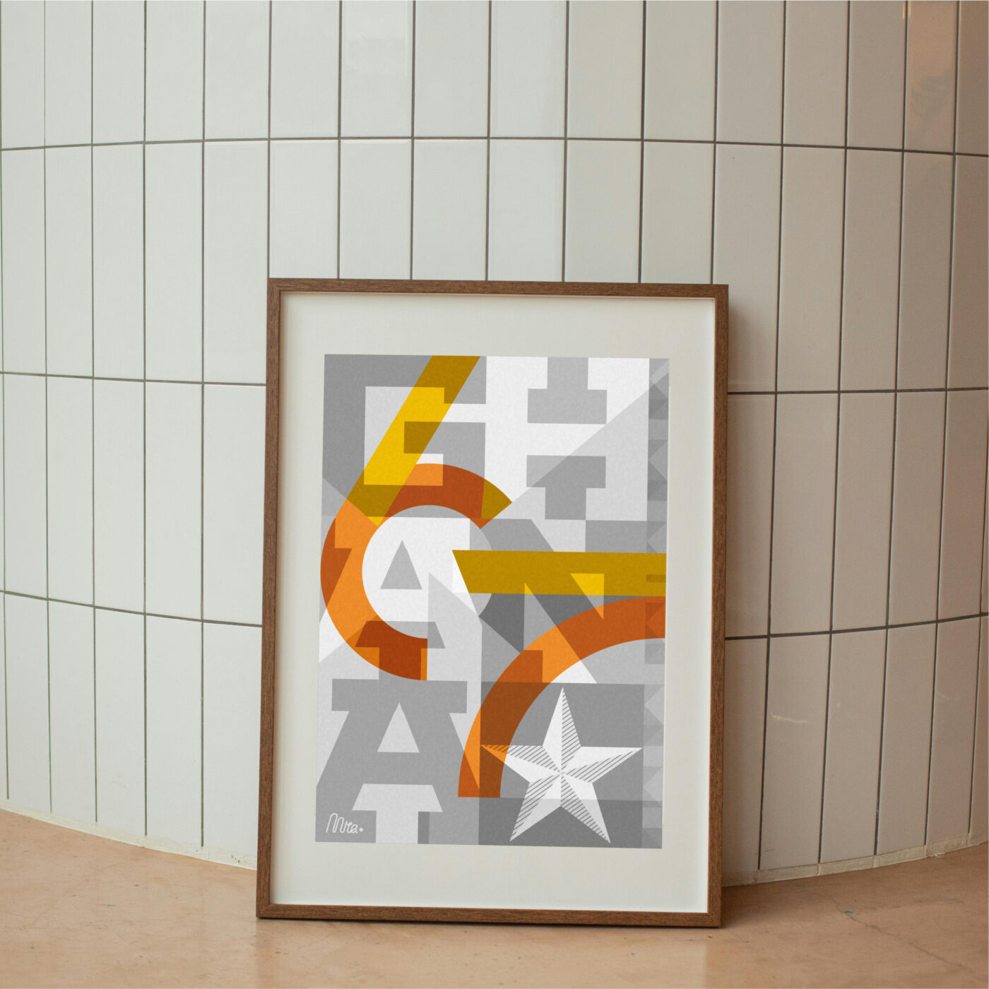
So the rigidity of the type, mediated through the idea of the textured grid, produced something more layered than I typically go in for. Thanks to Sulley, and Geismar et al, and [unattributed CCTN architect], and Lanoo.
So that was that.
Except…
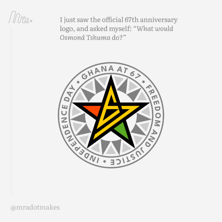
Not sure why I Googled (well, DDG’d) for ‘Ghana at 67’; maybe I should not have done. Because there is an official logo.
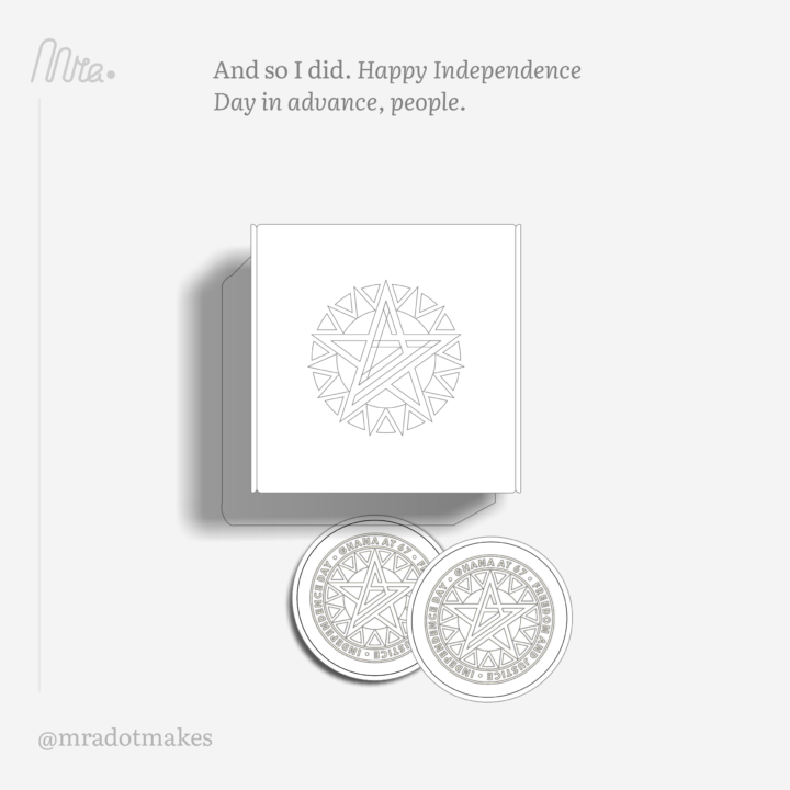
I did not get the logo. It stuck in my mind though, enough that I opened my sketchbook. It only took two sketches to realize that the figures 6 and 7 fit quite nicely together in a star shape. So I got to work.
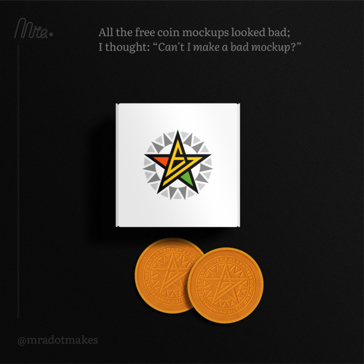
Not why I posted it to Instagram, but it was a good hunch. I think the colour does as much as the composition, but the design stands out quite well in the Feed. Joshua Cleopas was nice enough to repost it, and that got a bunch of eyes on it. And then somehow it found its way to Osmond Tshuma – I first saw him on DEX Ghana a couple years ago, sharing his wonderful archive of posters celebrating African state anniversaries, so I referenced that in my caption. Probably I already had him in mind while designing, because the geometric pattern around the star feels quite Southern African.
And then a friend messages me on IG, with a screenshot from his Twitter: “Not sure you’ve seen this” was his caption. I had not!
I had to find my Twitter password to see it for myself, because now you can only view pinned Tweets without logging in. (And apparently I’ll need to post a lot before they treat me like a human? I’m cool with bot status.)
Thanks to Joshua Cleopas, and Osmond Tshuma, and everybody who takes the time to share inspiration and encouragement. Design, as ever, is about communication and connection.
And since that is true, I also have to thank [unattributed designer of Ghana at 67 logo]. I can’t say I like it, but it clearly took a lot of time and attention – and it has sparked several conversations for me. So sincerely, thank you.
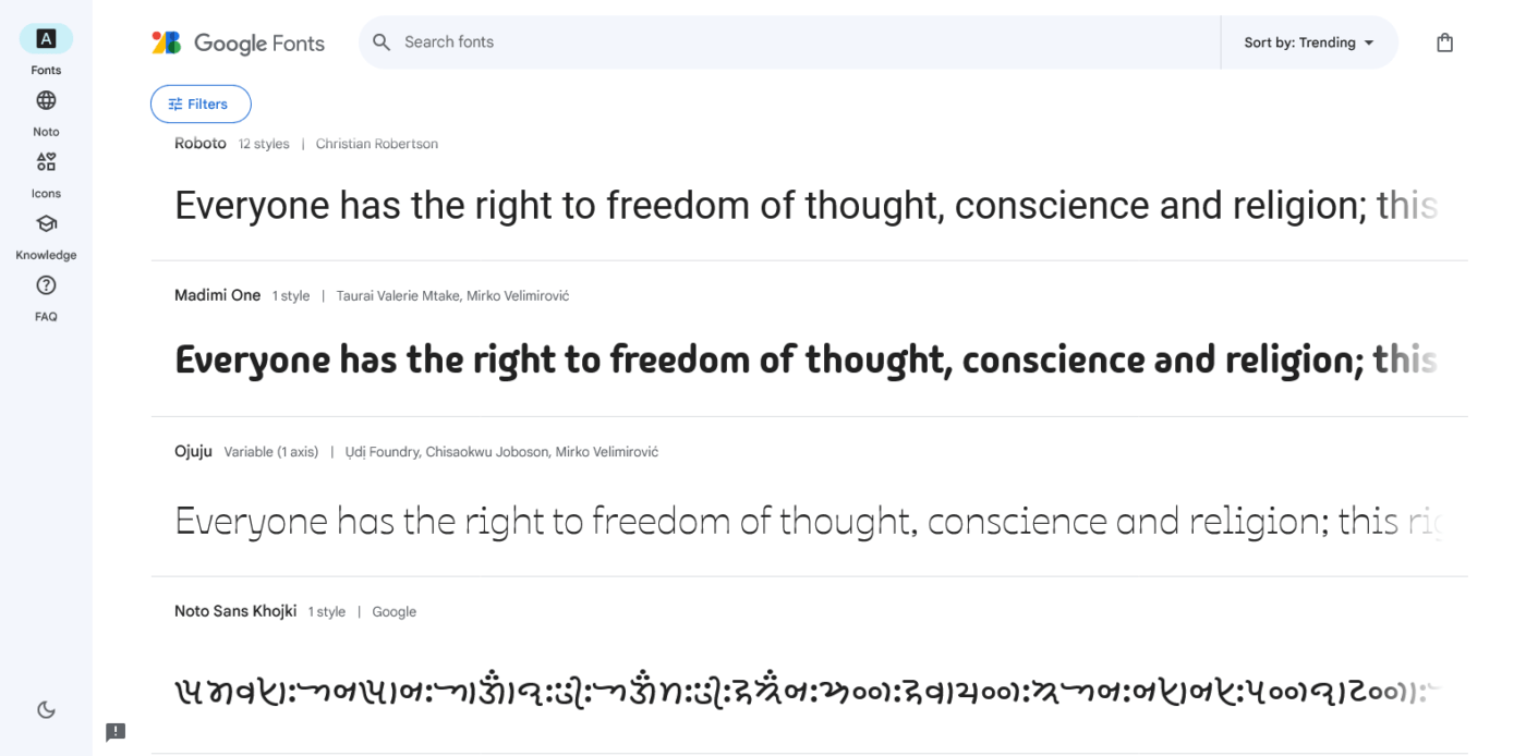
Another cool thing I learned from Osmond Tshuma’s Twitter feed, quite significant. Two African designers just released typefaces, shared in Google’s Font Library: Ojuju references masquerade culture, and the first draft of Madimi One has been in my Behance bookmarks for two years.
From LinkedIn I learned that Simon Charwey was also helpful in getting Ojuju made, as were quite a few type designers from around the world, including Eben Sorkin. Good things happen in collaboration.
Heartfelt congratulations to Taurai Mtake, and Chisaokwu Joboson!