Over the past six weeks or so, I started collecting interesting example of modals for cookie permissions. The results are not very encouraging, even after I chose to avoid any references to OneTrust.
JetBrains.com

Such a beautiful design, it’s easy to overlook the poor link contrast, and the fact that they could have put a ‘[R]eject’ option in there, without requiring an extra click.
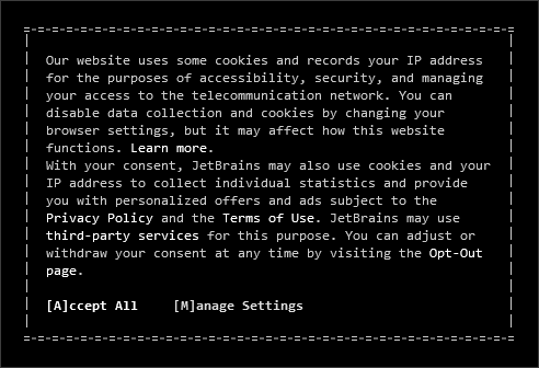
FYI: the ASCII borders are actually encoded as top and bottom borders with base64 background images, with the sides being base64 background images in :before and :after pseudo-elements. I guess that makes it scale extra-smoothly, but I’d trade a little of the design love for a better user experience.
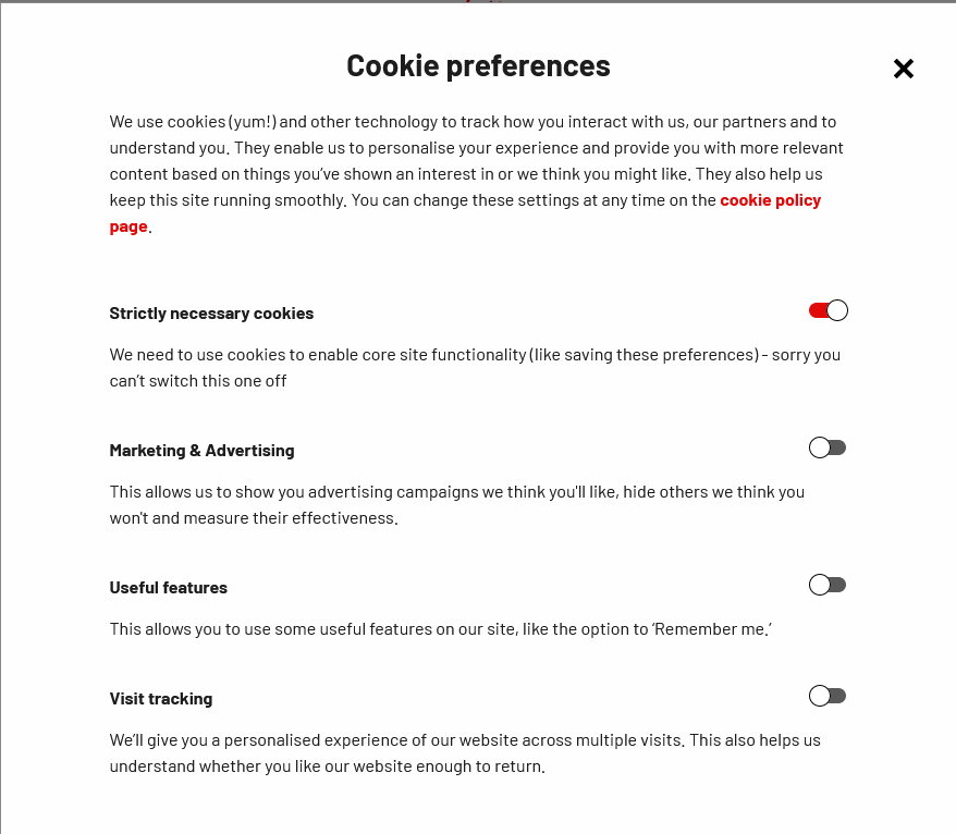
Virgin.co.uk – a rare customisation

It’s strange how many cookie modals are served by a paid solution, when so many of these sites have dedicated developer teams. I understand the administration may be complicated, but it is sad that the design isn’t necessarily expected to match the brand language system. Of the modals I’ve captured here, only two are unique in design. But this is an even rarer example of compelling, useful copy.
Virgin starts with a fairly regular banner popup, drawing attention to the ‘Accept All’ button. But when you click ‘Let me choose’ (which is a genuinely nice way to put it) you get a very nice modal with ample whitespace, and clear language. And they have a Cookie Policy page where you can revise your choices at any time; even reputable news sites may not have that.
Eu.bic.com

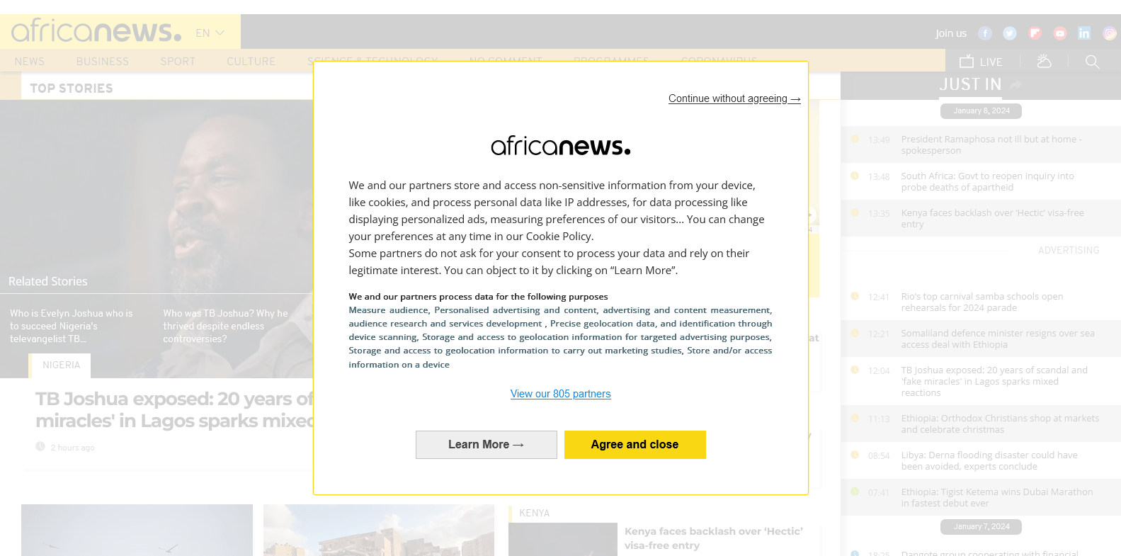
They emphasized the ‘Learn More’ over the ‘Continue without agreeing’ – and yet I am yet to meet anyone who goes out of their way to reject specific cookies or vendors.
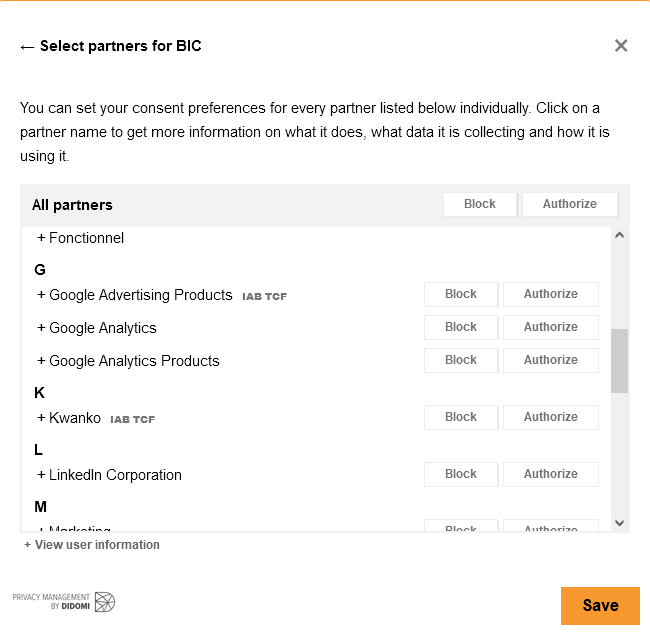
If you do choose ‘Learn More’, this is what you get.
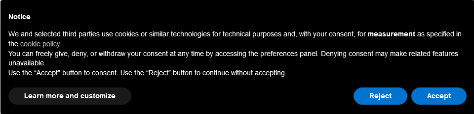
Was the hierarchy choice just bad design, or an unethical strategy? That Reject option is really not obvious. And yet Bic’s modal is a solution from Didomi, which actually has a much better version on their own site.
Didomi.io
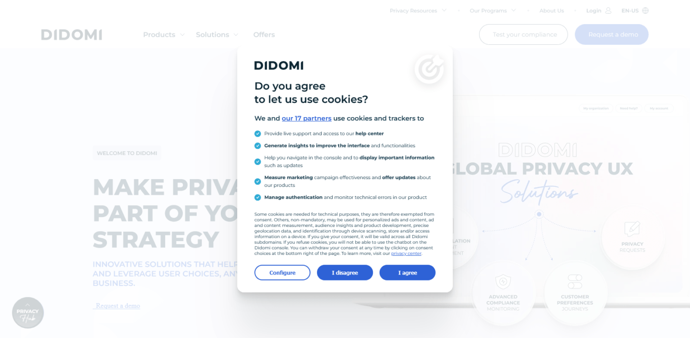
Same hierarchy for ‘Disagree’ and ‘Agree’, with ‘Configure’ right on the same level. Why do they allow their clients to mess up the user experience? Because AfricaNews.com is another customer, and theirs is identical, apart from the highlight colour.
AfricaNews.com
Really no reason to stick your logo on the cookie consent modal, unless you chose to white out your homepage when the modal loads…
GetSprout.app – simple and straightforward

It’s surprisingly rare to find a consent modal that resists the industry habit of drawing people toward the ‘Accept’ button. If they had gone further to put ‘Reject’ on the extreme end – research shows the extremeties are easier targets for users – I would rate them even higher.
Secrid.com – minimal detail, upfront access
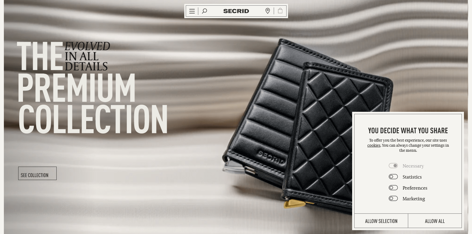
They put the cookie definitions and policies in a link, and exposed the levels of cookie access, with the optional ones opted out by default – no extra click needed to reject. ‘Allow All’ is highlighted, but it’s a muted highlight – is that a design mea culpa, or part of a low-contrast colour system? Either way, this one looks nice, and feels good.
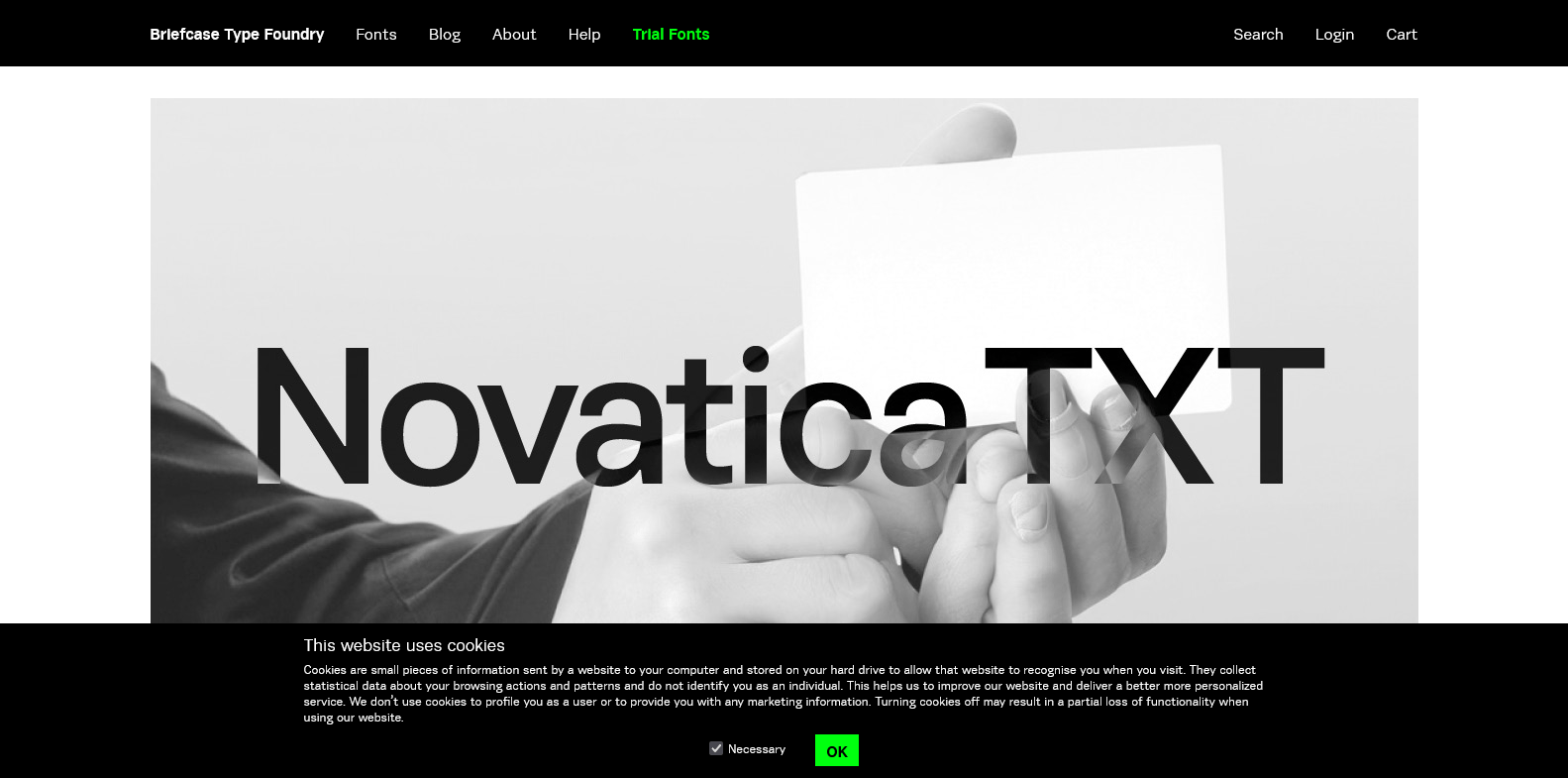
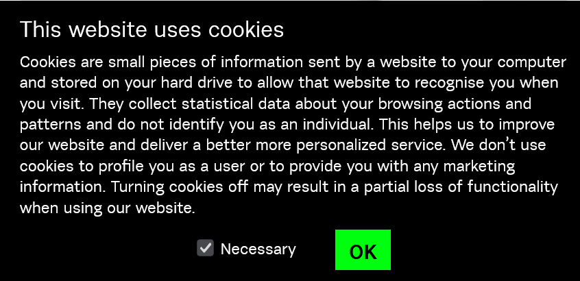
BriefcaseType.com
It’s a minimal site, so I actually missed the fact that the modal was custom built. And since there is no opt-out, this is essentially a notice – likely no queries behind it.
I’m not sure if I’m amused or annoyed by the non-interactive checkbox, or the institutional voice explaining what cookies are.
I don’t use cookies; I don’t think I know how to translate the data to improve my design or marketing, so I just go with best practice, which is essentially a summary of all insights, ever.
I also reject cookies wherever I can. I occasionally browse with a modal in my face, because the developer hid the ‘Reject’ button and I wouldn’t click okay. And that’s my choice, I guess.
But why is this aspect of our digital experience so lacking in vision and creativity? I wonder what an audit of the top 100 brands or industry leaders (by any metric) would reveal about how they value user agency and choice. Do disrespectful sites benefit? Does bad UX pay? I do pray that this isn’t the case.