In my early years as a designer, I traced logos all the time. I sketched them in books, I studied their grids, I spent hours on their curves. (The Joy FM logo was a real adventure.) This is probably the cheapest way to learn identity design, and it really helped me. So after a lapse in the past two years, I’ve taken time to recreate and analyze some of the most distinctive marks within my local space, in alphabetical order. Let’s dive in.
Accra Brewery (ABL)
Designer: N/A

(You know, I never realized that the playing card ‘club’ is actually a clover leaf icon.) The perspective on this icon is a thing of technical brilliance, and, after decades of use, it doesn’t look like it’s going away any time soon. If you feel like a challenge, try creating perspective on a symbol in a circle, without using digital effects. Then drink some water, go to bed, wake up tomorrow, and try again.
Allied Oil
Designer: Karen O’Neill (view the project on her website)

This mark seems to reference the mobius strip, but the curves aren’t continuous enough to fold correctly. (The original is a bit rounder than my version, though.) Great balance, partly due to the harmony of the palette. And the negative space subtly suggests an arrow, which is nice. Allied started out as the first private Ghanaian-owned company in the sector, with an identity that was pretty weak. For their rebrand about five years ago, they ended up contracting a UK-based firm. (Back to the palette: I wonder if they resisted the urge to ask for green to go with the red-and-gold.)
Alomo Bitters
Designer: N/A
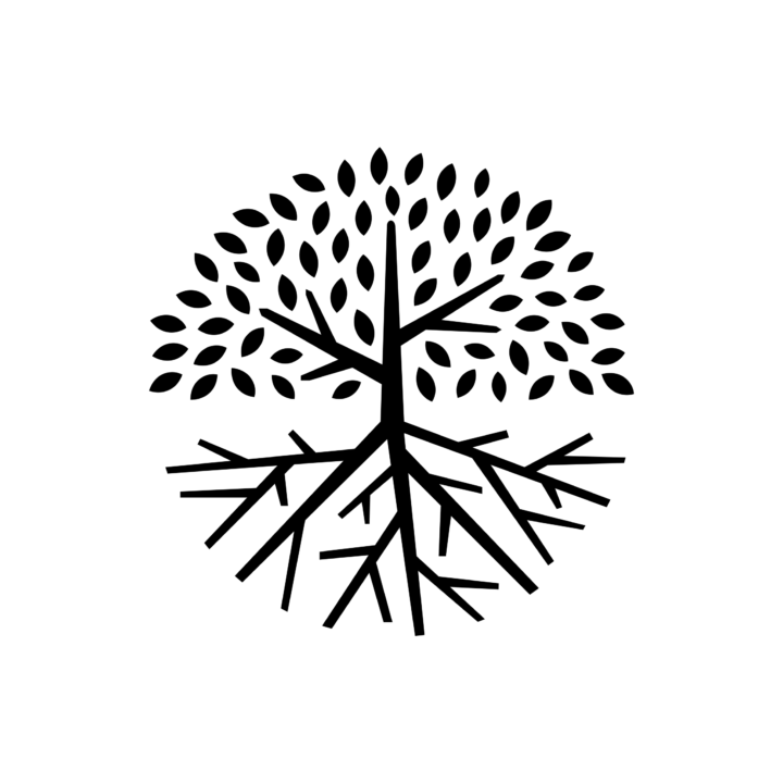
I really want to know who created this mark. It is so dramatic, so very detailed, that one could say that it fails the standards test for brand icons. But when you do product packaging, it’s always a plus to have a logo that commands attention on the label. The tree is expertly-drawn, so that balance is achieved without an actual circle enclosing the mark, and without pure symmetry. I also like Ghana’s other big tree icon (Golden Tree Chocolates) but this is stronger, and more adaptable.
Busy Ghana
Designer: N/A
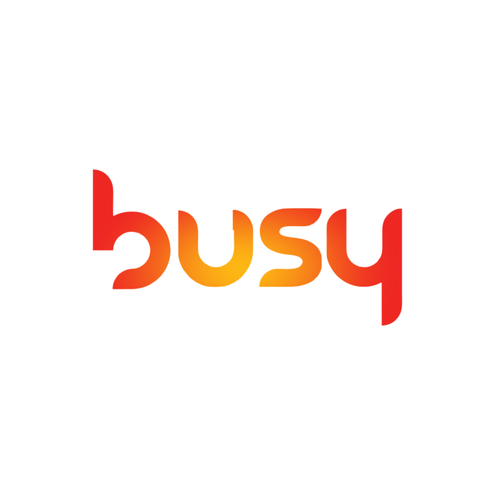
I’m tired of writing ‘N/A’ for the designer credits. I think I used to know who did this, but I can’t remember, and it’s very hard to find design case studies in Africa, even for firms with online presence. Anyway. The new Busy wordmark is an interesting example of the modular type style pioneered by Jan Tschichold and popularised by the Bauhaus school. It works fine, and the brand’s communications often feature groovy pattern-infused variations. It’s a nice, techy mark.
But the old one was just so right.
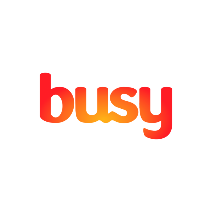
This was Busy’s logo in 2016, when the company rebranded and launched a aggressive bid for market share in mobile internet. The curves are soft and friendly, and that sly little ligature in ‘us’ combines with the gradient to offer an alternative reading. It stood out in the tech space. Then just one year later, they changed the identity again. The tagline used to be “(Busy) Making good things happen.” Post-rebrand, it’s “Great things happen.” Not sure what it all amounted to.
Darling Wigs
Designer: N/A

I was in traffic, two years ago, when this icon jumped from a billboard and hit my eye. It’s a D, and it’s a face! If I tried this, I’d likely mess up the construction, then convince myself that it’s just a weak idea. (Silhouetted face for a hair/cosmetics company? How original.) But this really works. It’s not just the negative-space profile that makes this idea shine; because the locks of hair break up the letterform even further, people will probably see the face before they read the letter. And the drawing is excellent.
Denya Developers
Designer: N/A

I’ve only seen this logo once in the wild: on a billboard just before the 37 Military Hospital roundabout, advertising this company’s new luxury apartments. I like how this staple trick of monogram design – customize the letterform, duplicate, rotate – has been elevated with the application of Ghana’s adinkra system. And it does look architectural.
Ghana Cement Company (GHACEM)
Designer: N/A
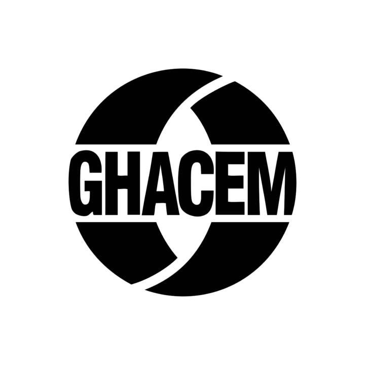
(The traced type felt too weird; this is an SVG version from their website.)
Did you know that GHACEM is owned by a European corporation? I had forgotten. It’s a part of the Heidelberg Group, which sounds German; but this logo feels very Italian. The gothic typeface has some old-school character, but it’s the disciplined alteration to fit the abstract ring that completes this mark. (For an example of a mark that dramatically alters letters to fit an enclosing shape, see GTP; that effect feels more appropriate for young, sporty brands.)
Ghana Oil Company (GOIL)
Designer: N/A

Please pause for a minute to appreciate the fact that this was a state corporation. Friends, this is one thing that market competition can achieve. The GOIL mark is very complex – so complex, I did not try to to find the underlying harmonies; I just traced. My first guess was the golden ratio, of course, because it looks like a nautilus shell – but I don’t see how it applies. Whatever the case, it works. The mark is said to represent the blurred motion of a wind vane’s blades, which shows that the company is looking forward to a clean energy future. (They look more like flames, I think.) And it lights up the filling station as well as the Shell logo.
But check out this throwback.
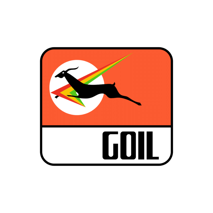
You remember this? It disappeared from my memory till I visited a farming district and saw it at an abandoned station. The type is really well-constructed, but who sees it? Look at that beady eye. Check out the cheeky little tail. We were taught that symbolic figures should always move toward the right, but this antelope doesn’t care. (Now I think about it, an approaching driver would see the mascot leaping toward the gas pumps. Even herbivores need refills, apparently.) I love this logo.
Ghana Television (GTV)
Designer: N/A
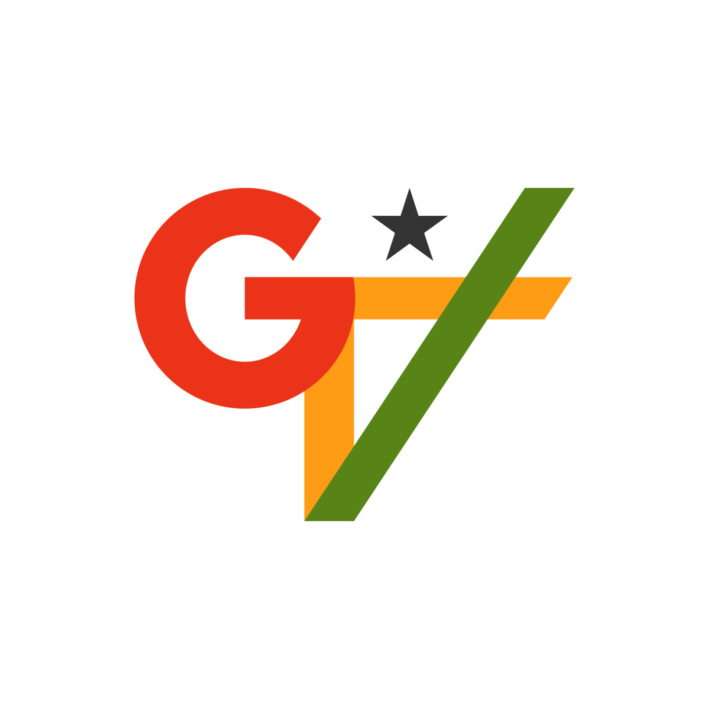
I gave this a tweak – mostly aligning the angle, and balancing the stroke weight. It didn’t take any time really, but I think it helped. Also, the color palette needed some fine-tuning; every Ghanaian designer knows how hard it is to make these three colours play nice together. It’s a great vintage wordmark, and we should really be nice to it. (This probably demands a promise to stop slapping 3D animation presets on it.)
Ghana Union Assurance (GUA)
Designer: N/A
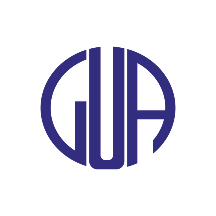
Here’s another classic mark. Again, I adjusted the construction a little, but this mark has always been respectable. The Art Deco type offers a good excuse for bending the letters into a shape, and the result still has some corporate gravitas. With that said, it would be easy to place this as a spa or bespoke garment label.
Guiness Ghana Breweries
Designer: N/A

This probably hits my top-ten for elegance, even considering global brands. The idea of the G‑within‑g could feel contrived, but it’s delightfully executed. The counterforms are carefully balanced, the curves relate closely to each other, and then there’s the little conceit of the three floating drops. I have no idea how the designer evolved this in reference to the classic Guinness harp, but it feels right. I’d be glad if they produced cakes instead of alcohol, but this logo makes me smile.
International Central Gospel Church (ICGC)
Designer: Nana K. Duah

I know this isn’t the standard version of the ICGC mark: I tried to combine the classic vim of the old design with the practicality of the new. All new church branches have the flat vector version on their signage, because it just makes sense, and the old one had many artifacts from the early days of digital graphics. A solid mark that stands as a reproach to every church that’s still using a 90s-era school badge. (ICGC’s website has a page that explains the significance of the various elements, if you are curious.)
Kaeme
Designer: N/A

(I know I could just remove the designer credits, and only show it when I can confirm the source. But I’m hoping to update this post as I find them; would be grateful for your help.)
The Kaeme brand covers an organic range of cosmetic products. Again we see a simple combination of letterforms (K + M) transformed by the reference to adinkra. The designer took the same roughened block typeface in the brand wordmark, used rotate and merge operations, and the result can probably last decades.
Kasapa
Designer: N/A

I really loved this company. I respected their commitment to fill a gap in the market, I liked their branding (with that cheerful audio logo), I liked the design of their phones. But they couldn’t survive in the warzone of Ghana’s telecommunications industry. I harboured an irrational dislike for the company’s reincarnation, Expresso, because their cool name and technically-brilliant branding had none of the warmth and hometown goodness of the original. RIP, Kasapa.
Prudential Bank
Designer: N/A

This one may be a biased choice. I have a soft spot for vintage logos, especially ones that are too well-designed for anyone to update. The colour palette of this logo is very understated, but effective. And the foreground-background concept is an idea that I added to my playbook after studying this mark. The bank is just about twenty years old, so it is possible that this was done with the first generation of vector graphic software. If so, more props for avoiding the pitfalls of digital effects syndrome. (For their 20th anniversary, it seems the marketing team wanted to refresh this mark. So they had the remarkable inspiration to crowd-source the rebrand. Be warned, you need a sense of humour to appreciate the results.)
Vanguard Assurance
Designer: N/A
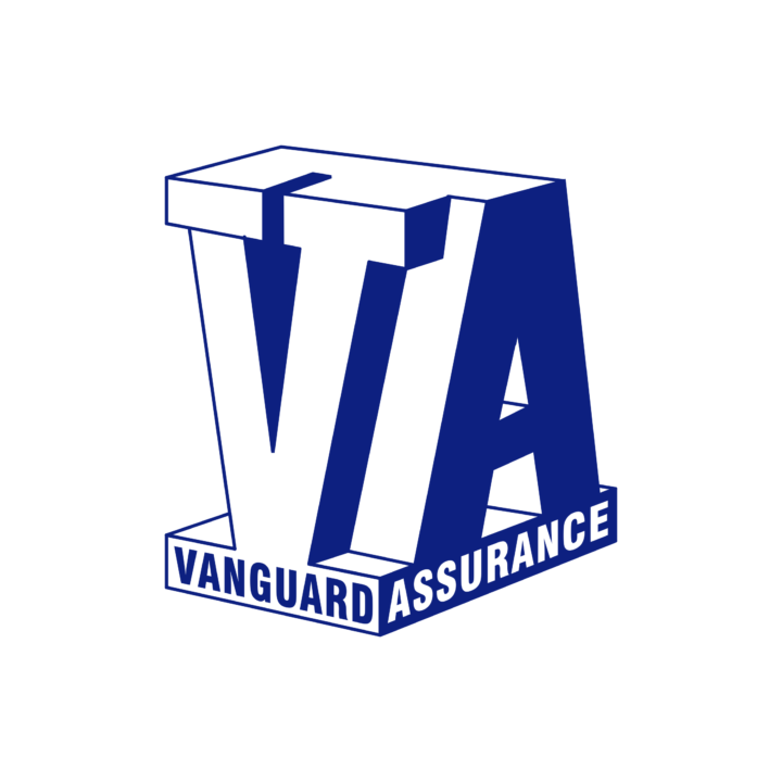
“With Vanguard Assurance, man, you’re covered.” Consistency works. Repetition works. Familiarity is an asset. This logo could be dismissed as a design student’s assignment in orthographic projection, yes. But the drawing is solid, and the mark is balanced, yet interesting. Still, this logo works largely because it has been given the chance to do so. In this generation of media over-exposure and hyperactive marketing efforts, will new logos be given the chance to amass the authority of a decade’s existence? I really hope so.
I’m pretty sure that I made some glaring omissions here; and if all the mistakes are grammatical, I’ll rest happy. Feedback and corrections are very welcome, as are suggestions for other roundups like this. Thanks for reading, and please pass on the link to another design lover.